Friday, 15 December 2017

Irongate Scenery - the bar


I’ve often thought that i’ve been a bit stuck in the past with my hobby, the vast majority of my collection is lead, although there is a growing resin and plastic contingrnt. So this is me embracing, what is very likely to be, the future - some 3D printed sculpts. They are from Irongate Scenery and are to be used for a bar interior that I have planned. 

Having painted these it is fair to say that I really dislike them. It is just simply the horrible texture of concentric lines that i’ve tried to hide with my paint job, that made painting them an incredible chore (even though these are very quick paint jobs). I came to the painting table with an open mind (and fully expected a different texture from what i’m used to) but I just could not muster up any love for them; sometimes when i’m painting I can imagine the decision making or see the style of the sculptor  as i’m working and this acts as a massive motivator to “do the sculpt justice”, because i’m not the keenest painter st the best of times.

Funnily enough, the warped top right table is greenstuffed from an instamold I made as there was a missing tabletop, and the familiarity of painting on that surface was much more enduring, even if there was a horrible warp to it! So maybe my bias is about familiarity or maybe I prefer painting things that have been made by hand. Whatever the reason, i’m staying away from 3D printed stuff and not grasping the future right now.

Tuesday, 12 December 2017

Modelling Workshop 5: The Coaching Inn and Forge (WD 143)

This is the final instalment of my revisiting of the Modelling Workshop articles from the White Dwarf's of the early 90's and the only one that I had not previously made as a teenager - the Coaching Inn and the Forge.


It was quite an extensive build and the instructions, at times, were particularly hard to follow, so some problem solving was required (which my teenage self would have struggled with). The roof to the inn was especially problematic; joining two sloping edges...

I've also made a few changes, namely the size of the footprint has increased, it always felt a bit cramped from the photos in White Dwarf and you couldn't really appreciate the two buildings. I've also improved the stable design and made a removable wall from the back of the courtyard so that the two buildings can be separated without creating an open courtyard. 


The doors, as per the article, are hinged on some paperclips.


Here you can see the forge and stable without the coaching inn and the long removable wall in place.


A better view into the forge and with it's roof removed you can see the forge itself (made from foam)


And the coaching inn by itself (pre-weathering):


And some Wip's so that you can see the construction and some of the materials/processes:


This image inspired me for the creation of the forge:


And the original article in case you're interested in re-creating this yourself:


And finally, my terrain building skills came in useful for my daughter's History homework, we worked on this together and she now has to learn the secrets of painting and in particular some quick dry-brushing and weathering techniques....


Thursday, 7 December 2017

A Plague Cart for Deadcember

I converted this Plague Cart up quite a while ago and as we have entered the month of Deadcember, I thought it a perfect opportunity to paint it up. It will eventually feature in my Lost and the Damned Army as the Nurgle list offers an opportunity to have one for free (!) and it will accompany my unit of zombies and help their instability tests.

The old Citadel sculpt it great, however you'll notice a few changes and additions to my version. The sculpt of the original rider was a bit too squat and comic like for my tastes, so instead I plumped for a a more sinister Nurgle champion. He himself was given a plastic gong and bells from a Skaven kit (with all the iconography scraped off) to add [silent] sound to his impending arrival and I bent his feet a bit so that they looked as if they were gripping the shaft of the wagon.


You'll also note the addition of a Plague Doctor who had a greenstuffed mask applied over his face. This is also a contemporary Citadel from the Fighter range I believe (a thief if I recollect).


You'll also note a few additions to the skeleton pile - the original piece looked a bit scant so I added a few skulls and an additional skeleton almost falling off the back for a bit of dynamism and movement to the overall effect. His slightly pained pose looked perfect for this.


In terms of the painting I challenged myself to go for a monochromatic palette. I wanted to avoid the obvious inclusion of a spot colour of, for example, glowing eyes in exchange for a more ghostly approach to the ethereal colour scheme. I wanted this to contrast with the dark, solid plague doctor and the colour coming from the basing. This was achieved by priming white, washing with a dilute Nuln Oil, then highlighting with small amount of Nuln Oil and white in increasing quantities and then re-washing with a very dilute Nuln Oil.

The cotton wool mist effect was something I have wanted to experiment with for a while and after long consideration decided to apply it very finely here. I think it adds rather than detracts from the model; although of course, as always, I'm intrigued to hear your opinions. Overall I'm pretty happy with this model though!

Monday, 27 November 2017

Black Scorpion Miniatures NPCs

I've been building a fair bit of fantasy scenery recently and I always feel that the buildings are missing something until they have miniatures added to them. The buildings provide a context for a narrative, but the models will create it and of course the most common way for a story to unfold is when a battle or skirmish unfolds amongst the scenery; the fighters going for it against the backdrop of a battlefield. But I also like to include a few npc's in there too, either mixed up with the fighting, or setting a scene before a skirmish or adventure starts.

So I did a bit of shopping and found these lovely npc characters from Black Scorpion Miniatures Tombsone civilian range. I was most keen on the barkeep, patron and blacksmith to populate my (nearly complete) coaching inn and forge, but the doctor character may also provide some ideas for a future project..

They are gorgeous resin sculpts and a real pleasure to paint. I painted the blacksmith and the barkeep first, both with deliberately drab colours and then switched up my paint palette to some more vibrant colours for the patron and the doctor:


I'm now plotting an-depth photo shoot. Be patient...

Monday, 13 November 2017

Scenery

I want to add some detail to my fantasy settings; I've been working hard on the large scenery (boards and houses) but want to add that extra layer of interest with some additional detail, either as a backdrop for narrative games or indeed for interaction between player and scenery.

So over the past few years(!) I've collected and made a sample of such scenery and last night I finished painting some:


These two bookcases (perfect for Frostgrave or for furnishing a dungeon or interior) are from the Reaper Bones line. I primed them grey (forgetting, out of habit) that you don't have to and then used lots of drybrushes and washes.

Anyone recognise the green spines of the collection on the left?


These two below are metal pieces from Midlam Miniatures. I needed an anvil for my in progress forge and the door will be useful in dungeon games and for a tavern interior I have planned


And finally a scratchbuilt fountain:


Made from (bottom to top) a mayonnaise lid, a fruit shoot lid, a felt tip lid and a couple of plastic horses heads. It was all primed, given a coat of the GW texture paint; Astrogranite and then highlighted up and washed down with dilute greens and browns  The water is an experiment with using Woodlands Scenic water for the still water and Vallejo water effects for the moving water. I'm pretty pleased with how it came out, even though it was a fiddly affair.

Tuesday, 7 November 2017

Scratch-building modular tiles - a tutorial


A very delayed follow up to all of those readers who were interested in how I made my first scratchbuilt modular tile, I've created a step-by-step photo tutorial for your enjoyment!

First up, materials you'll need.
  • Wooden base. I used some MDF cut into squares of 60cm squared.
  • Extruded polystyrene. (I bought a massive pack of it from an online retailer - there are lots on ebay). 2 different thicknesses if possible, one for the base board and one thinner one for the raised paths.
  • Outdoor varnish
  • No More Nails
  • Hot Glue Gun
  • Flat head screwdriver
  • Cocktail sticks
  • Stanley Knife
  • Circular cutter (optional)
  • Textured plasticard (optional)
  • Ball of tin foil
  • Pen
  • Black, grey, white, green and brown acrylic paint (or house paint)
  • Scatter foliage (I use birch leaves and some grass tufts).
  • PVA. Thick and dilute

Step 1.

Cut your baseboard to the right dimensions (often your DIY store will do this for you). Then varnish your board on both sides. This helps prevent warping as a moisture barrier.


Step 2. 

Cut your extruded polystyrene to size with your stanley knife. No More Nails it to your baseboard. It will take some time to dry, but will eventually adhere.


Step 3. 

Using your previously drawn out designs as a guide, cut out the required shapes from the thinner polystyrene sheets. Glue gun them down.


Step 4. 

Collect your engraving tools; flat head screwdriver, knife, cocktail sticks and punches. [Edit: having completed this laborious stage, I have now invested in some Greenstuff World textured rolling pins - I will try them out and post the results here....] 


Press down with one of the punches to create a gutter along the street edge.


Start scoring lines to illustrate the outline of the street.


Cut small incisions at right angles to begin your curb/gutter edge.


Apply a range of pressures to your flathead screwdriver to indent a random selection of individual cobbles. This creates a great variety of raised and lowered areas that is accentuated by the painting stage.


Use a cocktail stick to widen the score marks and create a less clinical line. 


Step 5. 

For the manhole covers I used some textured plasticard and cut them with a circular cutter.


Pressed them into position so as to create an indent.


Glue gun them down and create circular cobblestones around them.


Step 6.

I wanted to create a roundabout in the center of the junction (eventually there will be a fountain/statue to go in the middle). For this I again used my circular cutter, widening the distance for each circle.


Again using the cocktail stick to widen the incisions.


Step 7.

This is the time consuming bit.... Score horizontal lines across your street sections.


Use your screwdriver or a cocktail stick to create cobble shapes


And then use your screwdriver to assert pressure on random cobbles to lower them. This is probably the most important step in creating a realistic piece of street terrain as it adds a great texture that is emphasised during the painting stage. It takes time, but of course creates much better results.


Step 8.

With the road sections complete, move onto the paved areas. I use a biro for this to engrave a random collection of paving stones. Again I'm hopeful that the Greenstuff textured roller will speed this stage up no end.


Step 9. 

Using a ball of crumpled up tin foil, roll it over the surface applying different pressures to texture up all the work you have done so far.


The making is now complete, onto some painting (this bit is really quick).


Step 10.

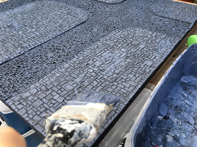
I use some house paint that I picked up for next to nothing; who'd want this grey on their walls? The unmixed paint is my mid tone, so stage one is to mix it with some black acrylic and some water to create a dark base coat.


Don't worry if you cant' mix up exactly the same tone, in fact I'd encourage you to use a variety of dark tones for your base colour.


Leave it to dry and you should have something like this:


Drybrush the fuck out of it. First coat should be your mid-tone, ie straight out of the pot. When dry add at least two lighter drybrushes by adding larger quantities of white to your mid-tone. Careful not to get too much on your brush.


Until you have something that looks like this. You can see that I haven't consistently applied the lightest drybrushes, they are down the center of the street and in "patches" on the pavement. It just breaks up the shapes and areas.


Finally, apply some washes. A bit of green and a bit of brown and varying amounts of water to create a wash. I always start off very dilute and then use slightly bolder colours as I progress:


Until you have something like this. I tend to apply my less dilute and bolder colours to specific areas (gutters, corners etc) where you are more likely to get a build up of dirt and moss (which is basically what these colours represent).


Step 11. 

Applying some details. I rusted up the manhole covers with some oranges and browns and then used some thick pva glue to apply scatter such as the bird seeds. I've also experimented in using dilute pva in a spray bottle to help keep any errant leaves fixed. I also added a few self-adhesive tufts of grass to the areas where I would expect them to grow (corners and edges mainly).


And joined together with my first board and populated with a few pieces of scenery.