Showing posts with label freehand. Show all posts

Monday, 24 July 2017

The Minotaur and a tale of butchery and salvation.


During the last month I've had some hobby time out partly enforced by work commitments and partly lack of motivation. So to get out of my slump I painted up a conversion I completed some time ago. Now I have realised recently that I've always subconsciously divided my work into two distinct camps; convert the fuck out of new plastic or carefully collect and paint old lead. I give no value to plastic but hold the lead in a high regard, mostly because of nostalgia and of course the fact that it is oop (certainly from Citadel anyway). So I thought it was time to change that, I'd always been inspired by the lead conversions from White Dwarf back in the day, so let it be my turn to return to something I thought nothing of as a teenager in the 80's. Time to break out the jewellers saw and the pliers and get to work...

Now I didn't approach this willy-nilly, I chose a lead model that I wanted to paint up (i.e. it is one of my complete collection of the Citadel Minotaur Lords) but one in which the sculpt is a bit shit and could be improved upon by me. With this sculpt I always felt that the head looked odd without a neck and that the arms were disproportionate (i.e. Too short) and strangely tethered to the sides of the body (no doubt due to casting constraints) so I chopped it all off and ended up with this:


A new pointing arm from an Ork was added to give him the look of a leader and a mid-hammer minotaur head that had a bit more menace about it:


Now I didn't want to completely discard the chopped off pieces and decided to re-use them on the conversion. With the head I thought that it would be fun to make a three headed minotaur with the new head in the middle and the old one (and a re-mould of it) on the other. I'm a sucker for symmetry. So I used the Instamould to get a cast of the head:


And filled it with milliput initially:


Which really didn't work so went with greenstuff the second time around which really worked surprisingly well: 


I also re-used the club which I had earlier cut off; attaching it the belt behind him:


And re-sculpting the haft with some milliput:


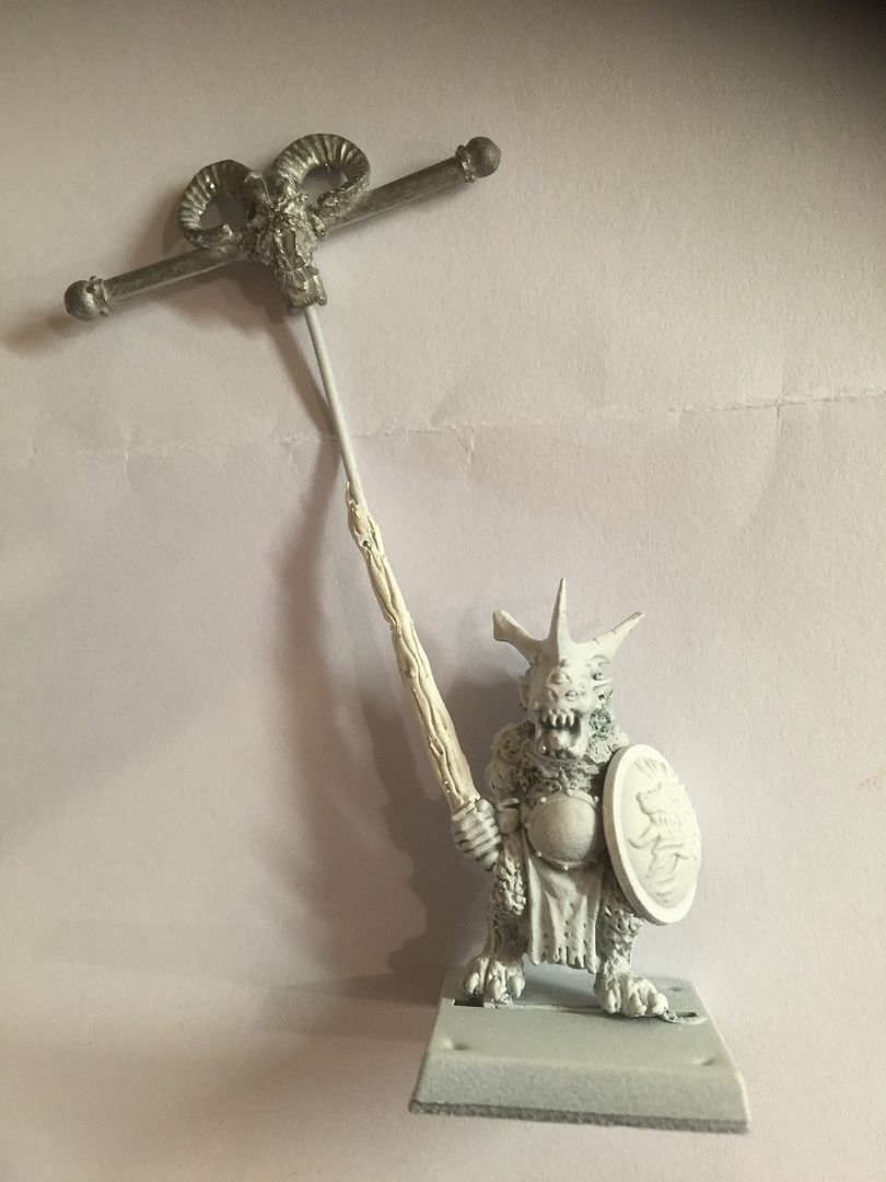
Here with the two heads re-attached and banner pole inserted:


And some additional work on the pole, garden wire wrapped around the paper clip to help me sculpt a gnarly old tree and a plastic vulture perched atop:


The final greenstuffing on the banner pole and some old-school mushrooms on the base:


And then decided to add some plastic horns and a bell to add some more detail:


Now of course there was another source of inspiration with this build; John Blanche's esteemed minotaur banner bearer which also has multiple heads and a myriad of other conversions:


So I too went to town on the banner design, following a more obvious route of Greek Mythology for the banner image:


I think it's an improvement on the original.
Now onto the rest of my collection of Minotaur Lords...

Friday, 9 June 2017

Handmade Goblinoid Combat Cards

I decided to make my own set of Goblinoid Combat Cards, using photos of my own miniatures, having seen the great work of Nico with his Frostgrave version and of course Fimm's completed set of Goblinoid miniatures. I have decided to take my version of the project in a slightly different route and go as old school as possible, eschewing Photoshop/Illustrator for the layout of the cards and instead going down the handmade collage and freehand route.... Here are the first three (I think I will go over the gold writing with yellow paint to make it truer to the original cards and to give a greater contrast - the gold is lost a little on the green card). The first three:


The idea being that when I have a complete set, I can give them to my son as a Christmas/Birthday present (he's currently 4 but may be a teenager by the time this project is complete) and we can play together with my hand made cards with photos of my own miniatures. Of course we could just play with the miniatures themselves, which I have only just realised as I'm typing this!

The template:


To make this I used some green card and cut it to the same dimensions as the original, including the curved corners. The stat area was a strip of pale blue card, cut out and stuck down, followed by a thinner strip of white on top. The area to house the photograph of the mini was a smaller white shape on top of a slightly larger piece of black card. Some careful pencil lines were drawn in to give me the space to carefully write the title of each stat in place. You can also see the pencil lines for where the names and titles of each character will go. The template was colour photocopied onto nice thick card (I will laminate the cards at a later date).

Now of course we all make mistakes, mine was to colour photocopy this without removing the pencil lines or the white central shape. This meant that every colour photocopy has the pencil lines on (and can't be rubbed out - aaah!) and the photo I take of each completed mini has to be cut out to exactly the same shape as the white, if it's too small the white can be seen around the photograph. But no biggie, I can just black this out if necessary.

Finally on the colour photocopy I then decided to hand write the characteristics of each goblinoid. Partly because I have no idea how to do it on a piece of software but mostly because I prefer hand making and the irregularities that accompany that anyway. Red felt tip for the number stats and white and gold permanent markers for the namings. I will change the gold to yellow I feel though - agree?


Tuesday, 21 February 2017

BitzBox Warband Champion on Palanquin

This BitzBox warband project had been on hold (and forever pushed further down the painting queue) largely due to this fella. It was great fun to kitbash and convert; delving into my box of bits to create a new palanquin and leader, but the thought of painting the bastard was daunting to say the least.

But I've done it and as usual it was never as bad as I had expected or built it up (a bit like public speaking). 

So here he is; Seth Spawnbloat. Level 10 Human. Champion of Nurgle. Infestation of Nurlings. Atrophied Arm, Enormously Fat. Palanquin, Shield, Warhammer


I primed the whole thing black (to make sure it was dark in-between all the nurglings) and then used a zenithal application of white from above. I much prefer using my ink washes/glazes over a white undercoat and then building up the subsequent highlights over the top of that.

With the Nurglings I used a limited palette of just yellow, green and orange inks (some mixed together) to keep all of the nurglings unified in colour. After the various washes were dry I highlighted up, which was a pretty tiresome effort.


The wooden areas were washed and glazed with a variety of greys and pale browns for the baser colour and then highlighted up with pale greys to try and create a weathered and old looking wood effect. A final addition of some subtle green glazes were applied to give a slightly mossy look to the wood. The idea being that a slightly green tinge to the wood would be complemented by the orangy/red rust colour on the metal areas.

The writhing mass of bodies on the throne (which was fun to make) created a few challenges. I wanted to make them look like they were the same colour as the wood, so that they were actually part of the throne, but this time highlighted up with a little Elf Flesh so as to give them a bit of a warmer skin tone.


You may have noticed the tattered awning surrounding the palanquin. This was an addtition that I expected to make as there was a slightly annoying gap between nurglings and palanquin that ruined the illusion of the mass of nurglings lifting the dais. To mask this I added this decoration and deliberately made it look tatty, both by ripping the paper and washing several layers of grungy sepias, browns and greens.

The images on the awning are taken directly from the page borders found in the Lost and the Damned.


Likewise the banner behind the champion. My first idea was to use a crow illustration from the Fighting Fantasy books but it looked a bit lost on amongst so much else. The black lining could not really compete with the busy-ness of the model. So I painted over it with the most iconic Nurgle image possible, Les Edward's original illustration for the Lost and the Damned itself - just on a tiny scale!

It actually wasn't as hard to do as I though it might be. Once I had added some thin layers of background colour, I went about sketching the outline of the GUO onto the background with diluted black and then added the shadows with Rhinox brown, before building up successive highlights with a range of pale greens and yellows. I then re-emphasised the shadows and added some spots of pinky/red for the sores.


The champion himself needed to stand out amongst the colours I'd already used and I'd already decided that I wanted him to look quite pale. I ended up going a bit pinker than expected, only to make him pop from all the other colours. 

Writing this all out does always make me realise just how much internal thinking occurs when painting models, an ongoing internal monologue.

The final element to complete was the shield and again I wanted to create a nice contrast with the warmer colours of the champ, so I hit the demonic shield with the baby-blue treatment and a bit of subtle purple on the tongue and yellow on the horn to mimic the warmth of the flames higher up in the composition.


So has the painted version lived up to my expectations? Those expectations were pretty damn high after being so proud of the actual build of this model and I have to say that I think the paint job does the model justice. I'm certainly happy with all the decisions I made and the composition and balance of the whole piece holds up. I know I'll never be the best painter around, but this is up there with my very best.

Hope you enjoy it too. I'll post up some photos of the finished bitzbox warband later..

Tuesday, 1 December 2015

Freehand banners, my collection so far (plus a tutorial)

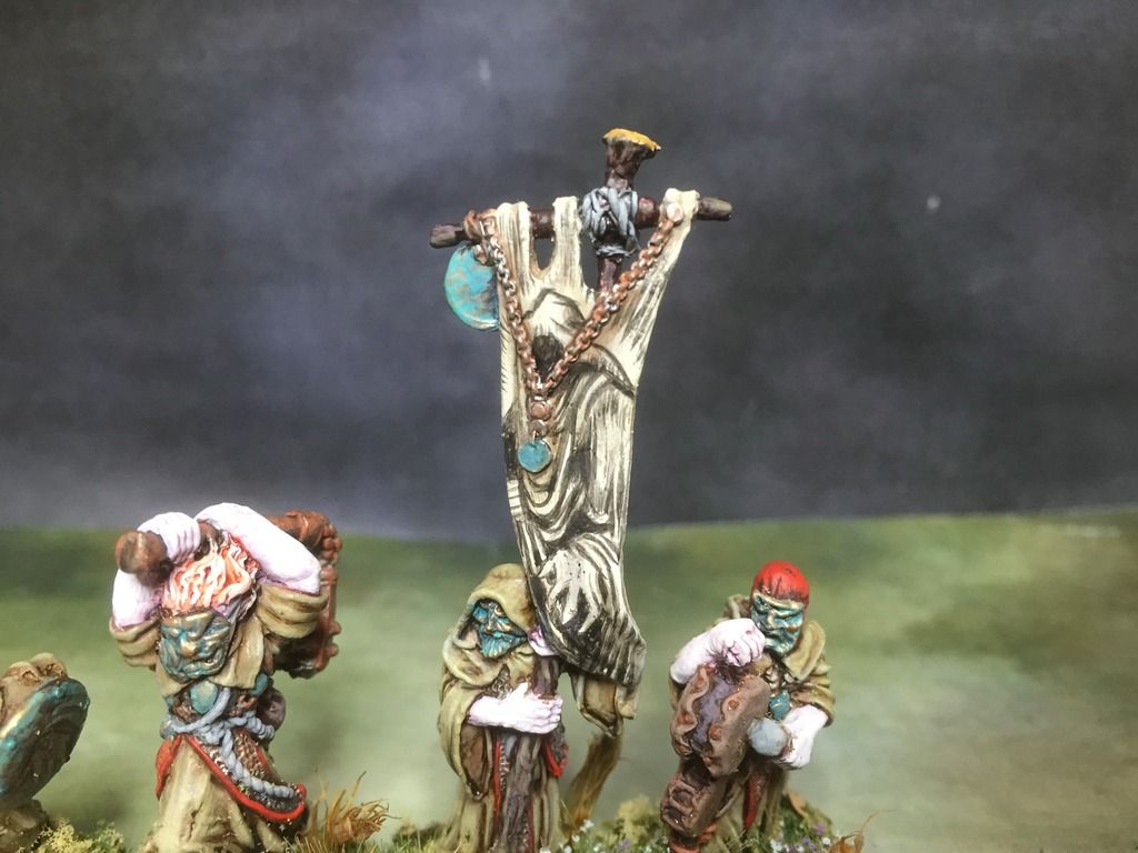
Here's my latest freehand banner, the first model for my Bitzbox Warband, a cowman, carrying an image borrowed directly from Fighting Fantasy's Trial of Champions (Illustrated by Brian Williams):


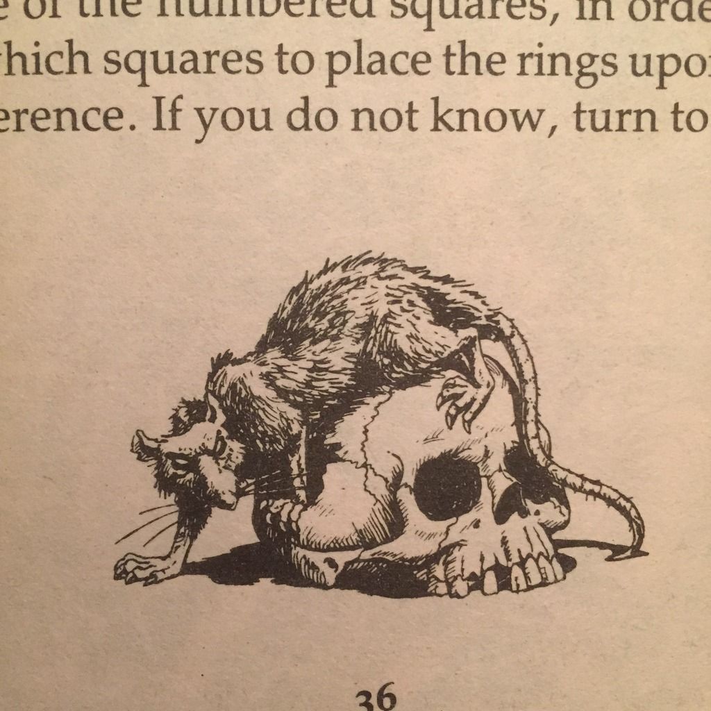
Here's the illustration which I copied, I found it quite appropriate for a beastman unit and this standard bearer also has a Skaven head at the top of the pole to re-emphasise the rat-theme.
So here's a short step-by-step of how I created this banner, which is pretty much the same technique I use for all my freehand banners:

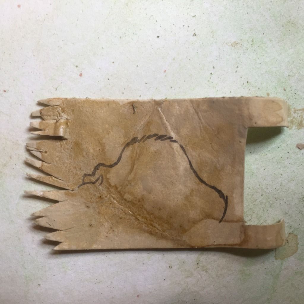
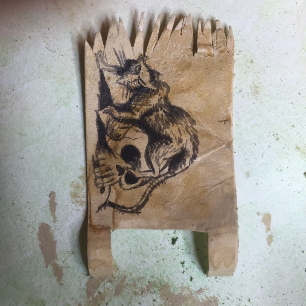
The piece of cartridge paper was drawn to size (based on the size of the space on the banner pole) and two lengths kept at the banner end for attachment. This was then cut to size with a scalpel. It was painted with bleached bone on both sides and washed with a sepia mix to exaggerate the creases I had already added.

At this point you can see a very fine ink outline being applied, taking care to ensure accuracy.
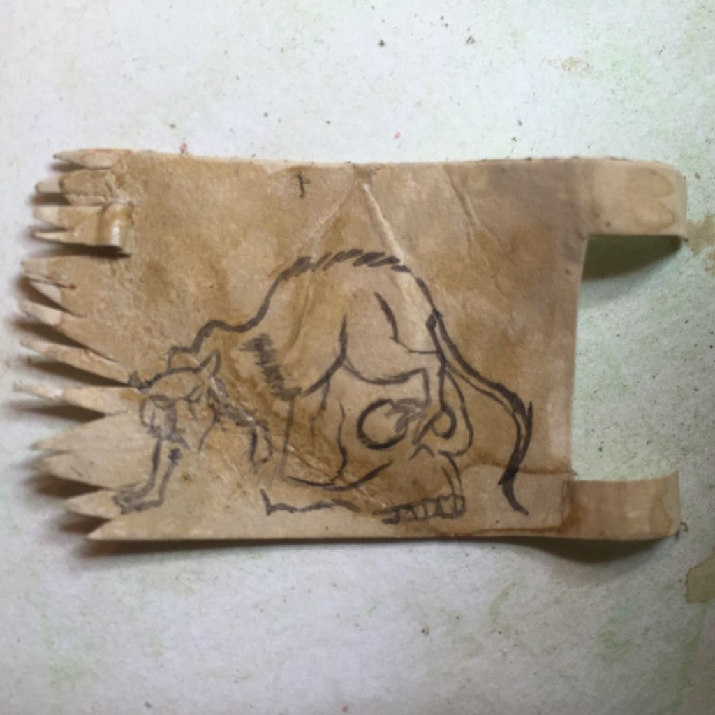
Most of the outline has now been applied and some detail and tone can be added.
By adding a touch less water to the ink, it becomes more opaque and I can build up some darker tones and marks, while still leaving the lighter mars as they are.
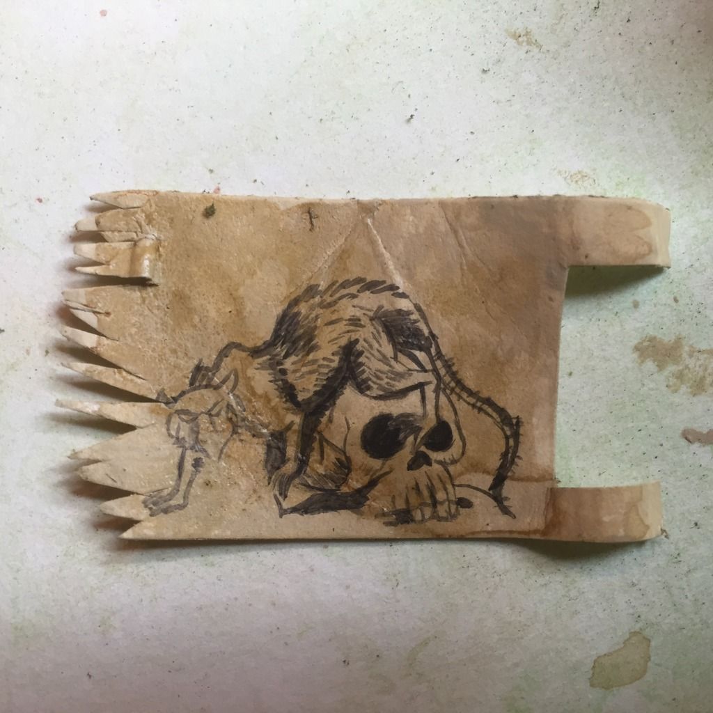
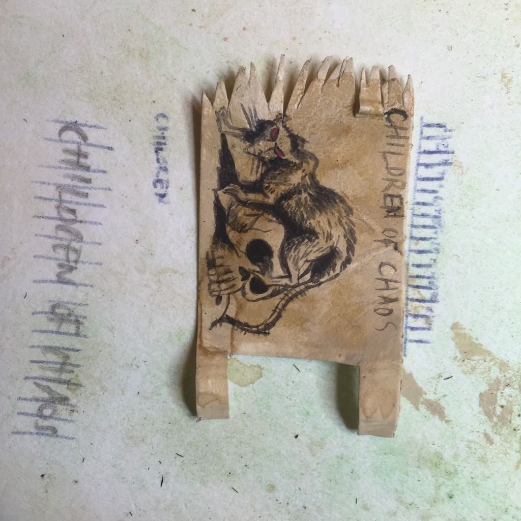
At least three tones have been added. dark, medium and light.  The composition/placement of the image was a bit unsatisfactory as it left too much space at the top of the banner, so I decided to add some lettering. Partly inspired by the banners of Bryan Ansell's Chaos Army from Warhammer Armies and from the Beastman description in the Lost and the Damned, I decided upon "Children of Chaos".
Here you can see how I worked out the spacing for the lettering, 17 digits (including spaces) were drawn onto the paper next to the banner and then the letters were painted on within that space. I wish I had placed them a few millimeters lower..
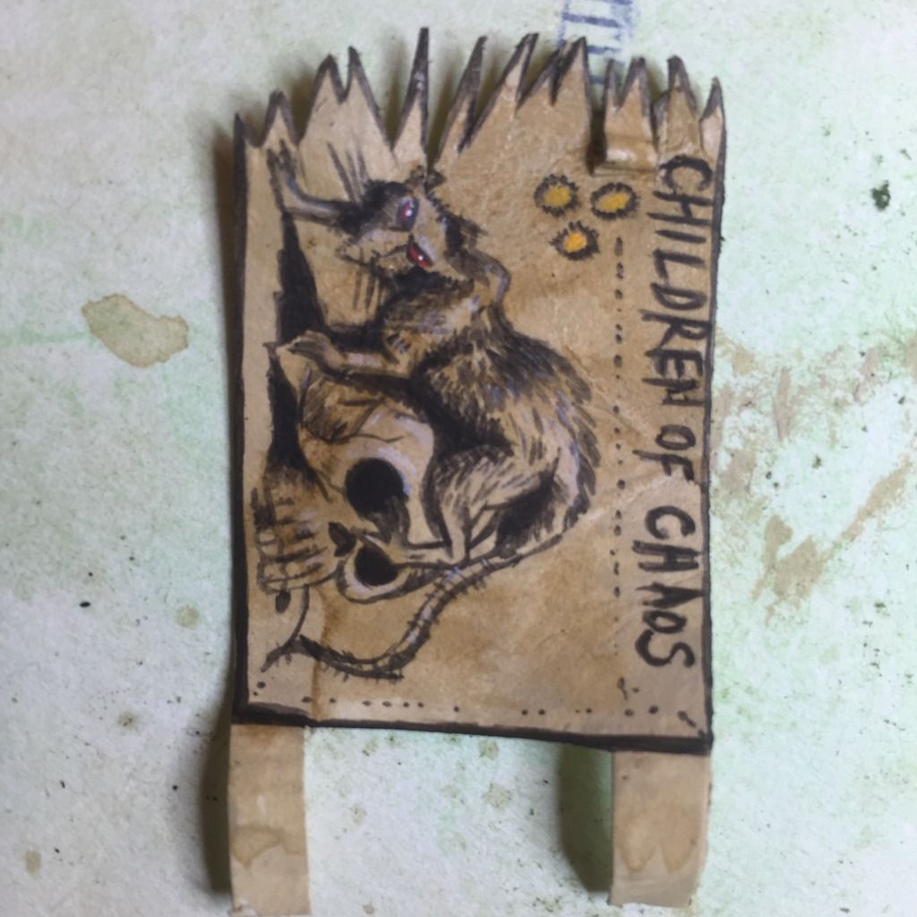
The final stage was to add a frame around the banner to give it a bold edge and keep the image grounded and then some red to the eyes of the rat, a yellow Nurgle emblem in the space to the left of the design and finally some very pale white washes in the areas of highlight on the rat and skull. I just find this helps make it "pop".
So there you go. All that was left was to attach the banner to the pole with some superglue and when dried I then tweaked, teased, bent the banner to give it a sense of movement. Ideally the banner should have come off the pole at a greater angle, closer to horizonal, to capture the sense of movement as the beastman runs, but I had to settle for the appearance of it being caught in a breeze across the model.

Having completed this model I realised that I was quite proud of the numerous freehand banners I have created in my collection, so I thought I'd put them all into one post for you to see (and for me to do some sort of geeky cataloging):

From my small Chaos Cultist warband, based on an illustration by Bob Harvey.
From my Rensburg (wip) army 
My deamonic banner for the plaguebearers, Very similar to my cultist banner I realised as I documented these!
The banner for my mercenary ogres, the Rusty Flails. This illustration was from the Warhammer Armies book
For my small Orc Warband I used this illustration by John Blanche which I found in the 3rd Edition rulebook.

I wonder which your favourite is?

And here's the next standard bearer which I'll attempt, for my Beastman unit, but I'd like one of you to suggest an image for me to use here, ideally based upon oldschool gaming, so from one of GW's early (3rd edition or earlier) publications or from the Fighting Fantasy oeuvre:


Please post your ideas below, thanks in advance!

Tuesday, 17 November 2015

Bitzbox Warband pt2 - greenstuff (and warband record sheet)

I've been busy with the greenstuff and the sculpting tools in order to complete the next stage of putting this Bitzbox Warband together; prior to the painting stage:


The leader of the warband. I resisted the urge to greenstuff the fuck out of him, or more especially his palanquin. The unsightly gaps between palanquin and nurglings will be hidden by banners (see more below) and I decided to keep the texture of the balsa grain rather than greenstuff rugs/drapery on the surface which would have draped over the sides. I did add some cocktail stick spikes though. I may need to greenstuff some hands and feet onto the Nurglings which are on board the palanquin, as at the moment they are missing from having been clipped from their small plastic base. You can also see the small seeds and beads which I've embedded into the swollen gut of the Champion and on the sides of the throne I've added some textured/organic swirls which show the twisted and contorted figures writhing in the throne.


Here's the beastmen champion, old dog head, pointing into the distance, showing his steed where he would like to go. The only sculpting here (apart from gap filling) was the scorpion like tail of the Chaos steed and a bit of his mane.


The 5 beastmen. Most of the greenstuff here was used to fill gaps and of course create the occasional bloated belly. A flared trouser was added over the hoof of the gunner and a few dried seeds were embedded into the belly of the banner bearer. I have a freehand design in mind for his banner, which is based on an illustration from a, yeah you've guessed it, Fighting Fantasy illustration.


Added a typical fat Nurgle belly (with belly button) and some straps. Only a little bit of filling was needed on the tail join and he's ready to bang his drums. The pages on his flank with have musical scores on them.


I wanted to create an organic appearance to the shield, so kept the sculpting marks which were directed towards the center. Embedded in the center are 3 beads which represent the Mark of Nurgle, which I've repeated on his shoulder.


So next I'll start the painting, probably in the order of these photographs, starting with the palanquin leader - I have a feeling that it will be the most problematic to paint with regards to it's size and awkwardness. Painting all those Nurglings will be a chore and I'll aim to cover the gaps between them and the palanquin by having some banners hanging down from the sides of the wooden edge itself. I'm considering freehanding some of Holbein's "Dance of Death" woodcuts onto these banners, perhaps x5:


I've also created a Warband Record sheet which is pretty much copied direct from the back of the Lost and the Damned book, with a few changes which I found make it a bit more slick and usable. It's a good tool for recording your warband rolls and the adjustments to profiles, armour saves etc as well as future changes as your warband progresses. I've filled in the details of my Bitzbox Warband here: (please let me know if this link hasn't worked):


https://drive.google.com/file/d/0BzQY_hXqbv59Y2t1a2hBMUFBcUE/view?usp=sharing


And the blank template if you're interested:


https://drive.google.com/file/d/0BzQY_hXqbv59TWI4YVFmRjJ1UU0/view?usp=sharing


Time to start painting this lot up then, if I can avoid the distraction of a myriad of other projects....