Showing posts with label artwork. Show all posts

Sunday, 10 May 2020

Classic Chaos Beastmen (150pts).

This blog was originally set up, some years ago, to chart my progress in creating a Nurgle army from the classic Lost and the Damned tome. Along the way I have been easily, inevitably and enjoyably sidetracked by a plethora of new ideas, miniatures, games systems and competitions, but for now I've decided to come back to the project and try and complete it! Ive finished my Warhammer 3rd Edition Chaos Allies Contingent, which have the same basing, so I looked back at my many incomplete Lost and the Damned units and decided to tackle the unit which needed the least amount of work.

I had painted half of these classic Chaos Beastmen some time ago, and I remembered collecting them so that they were a disparate, ragtag bunch (certainly not just goats), of different shapes, sizes and races and of course choosing some of my favourite sculpts from this era along the way.

Here’s the now completed unit:


I've painted their skin with a variety of tones, trying to unify them slighlty by keeping the colours slightly drab and pastel like, and as always allowing the basing to tie them together further. 

The banner is painted from an image in Fighting Fantasy's Army of Death and is held by a Beastman that was regularly headswapped in Dale Hurst's iconic Tzeentch warband from White Dwarf 135, something I had always wanted to do since I first saw the article in 1991 and here I've done so with a new, plastic plaguebearer head added to the Citadel lead body. 


Here’s the original illustration  by Nick Williams, as found in Fighting Fantasy: Armies of Death:


The last part was to construct a movement tray, which is really more of a display tray to hold the unit together. More on how I do this in a future post.

So then that’s 14 Beastmen, with standard, making a total of 150pts.


Thursday, 3 January 2019

The Enduring Legacy of the Realms of Chaos

Remember those amazing illustrations from the original Realms of Chaos books, by artists such as Adrian Smith, Paul Campbell etal, the ones that provoked so many ideas and fleshed out some of the possibilities and potential within 3rd Edition Realms of Chaos? I still love looking at them today and often feel inspired to try and convert my own miniatures based on the characters depicted within them. But I don't have to so much anymore because the Games Workshop of today (which has more recently seemed like quite a different beast as to what I grew up with) has released some models that are so obviously steeped in and inspired by some of those very illustrations I alluded to earlier.

I rarely venture onto the GW website, so I am somewhat behind the times, but I saw someone else had painted this model (Sloppity Bilepiper) and assumed it was a conversion, but no, this is a bonefide GW release that is clearly based upon some illustrations from GW of the 80's, specifically the Realms of Chaos. I just had to buy it (and make a bit of an adjustment to make it fit a bit better with those illustrations and lose the, quite frankly, ridiculous staff);


The musical element, the dynamic, dancing poses (especially the Nurgling) are just so evocative of those early illustrations, especially the Dance of Death. The older Nurgling I added to Sloppity's hand is a reference to that era.


I had forgotten about my scenic photography backdrop, so I dusted it off (I actually had to and was surprised by the versatility of static grass) and used it again here:


 Before converting and painting this modern model, I just had to reach for my Lost and Damned book and look for the specific illustrations that I saw the link to in these sculpts. The two images were by Adrian Smith and Paul Campbell from the Nurgle pages in the Lost and Damned Realm of Chaos Tome, specifically the Dance of Death and Nurgle Calvalcade pages. Have a look:


So, as I was researching some of this post, I discovered that GW is releasing a game called the Realm of Chaos. It's not aimed for me, but it is nicely reassuring that my favourite era and output of model miniatures is seeing something of a revival for a new generation of gamers/painters. I'm looking forward to some new plastic models to paint and then sit alongside my original lead ones and hope they all are happy lined up alongside each other.


Thursday, 23 August 2018

The Chaos Dwarf Renegades

After some time, I've finally got back into my hobby, picking up where I left off with my version of the classic Citadel Chaos Dwarf Renegades. My paint job has been inspired by John Blanche's original illustration that was on the box art, using black, yellow and orange as the main colours and then based to fit in with the rest of my Chaos Allied Contingent.

The banner was a bit of a cop-out, printed onto stiff paper (although I think I will weather it a bit). I was going to try and paint my own version of the iconic illustration but didn't want anything else to hinder my, already drawn-out, progress with these:


The Master of Madness:


Drum and Drone Ulsen:


Napper Grundrin:


Foaming Mad Furrikson:


Doomaxe the Dreaded (now promoted to standard bearer as he snapped his axe in a duel with The Postman):


Khazek Doomlord:


Mad Morik Trollbiter:


Pulper Spikehead:


Tuesday, 21 February 2017

BitzBox Warband Champion on Palanquin

This BitzBox warband project had been on hold (and forever pushed further down the painting queue) largely due to this fella. It was great fun to kitbash and convert; delving into my box of bits to create a new palanquin and leader, but the thought of painting the bastard was daunting to say the least.

But I've done it and as usual it was never as bad as I had expected or built it up (a bit like public speaking). 

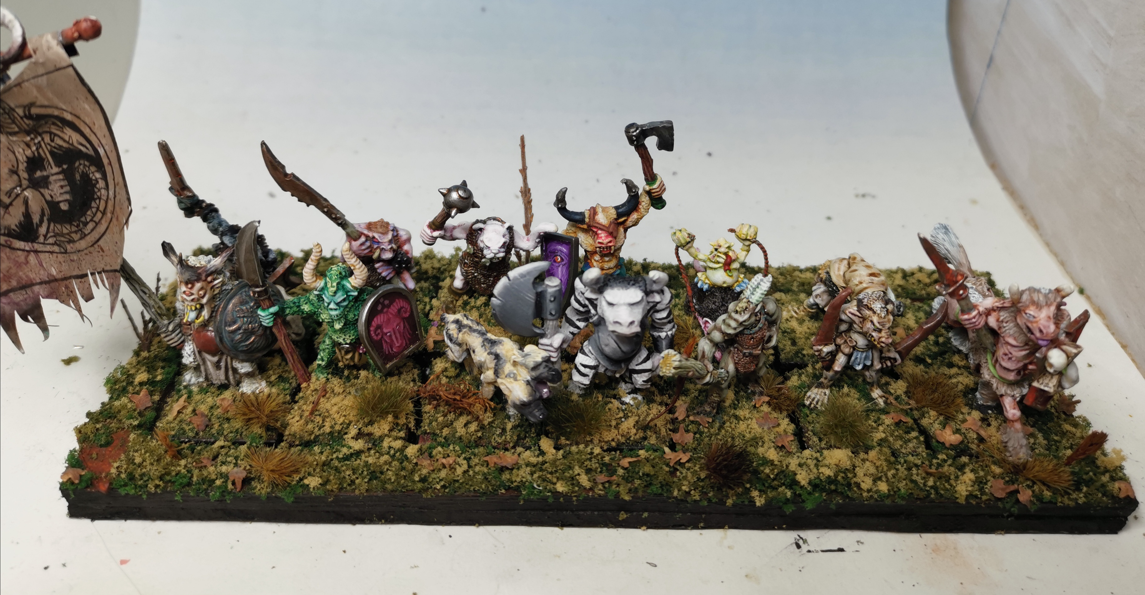
So here he is; Seth Spawnbloat. Level 10 Human. Champion of Nurgle. Infestation of Nurlings. Atrophied Arm, Enormously Fat. Palanquin, Shield, Warhammer


I primed the whole thing black (to make sure it was dark in-between all the nurglings) and then used a zenithal application of white from above. I much prefer using my ink washes/glazes over a white undercoat and then building up the subsequent highlights over the top of that.

With the Nurglings I used a limited palette of just yellow, green and orange inks (some mixed together) to keep all of the nurglings unified in colour. After the various washes were dry I highlighted up, which was a pretty tiresome effort.


The wooden areas were washed and glazed with a variety of greys and pale browns for the baser colour and then highlighted up with pale greys to try and create a weathered and old looking wood effect. A final addition of some subtle green glazes were applied to give a slightly mossy look to the wood. The idea being that a slightly green tinge to the wood would be complemented by the orangy/red rust colour on the metal areas.

The writhing mass of bodies on the throne (which was fun to make) created a few challenges. I wanted to make them look like they were the same colour as the wood, so that they were actually part of the throne, but this time highlighted up with a little Elf Flesh so as to give them a bit of a warmer skin tone.


You may have noticed the tattered awning surrounding the palanquin. This was an addtition that I expected to make as there was a slightly annoying gap between nurglings and palanquin that ruined the illusion of the mass of nurglings lifting the dais. To mask this I added this decoration and deliberately made it look tatty, both by ripping the paper and washing several layers of grungy sepias, browns and greens.

The images on the awning are taken directly from the page borders found in the Lost and the Damned.


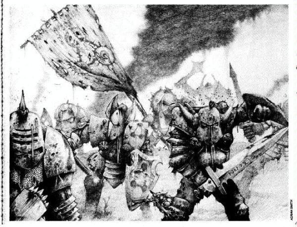
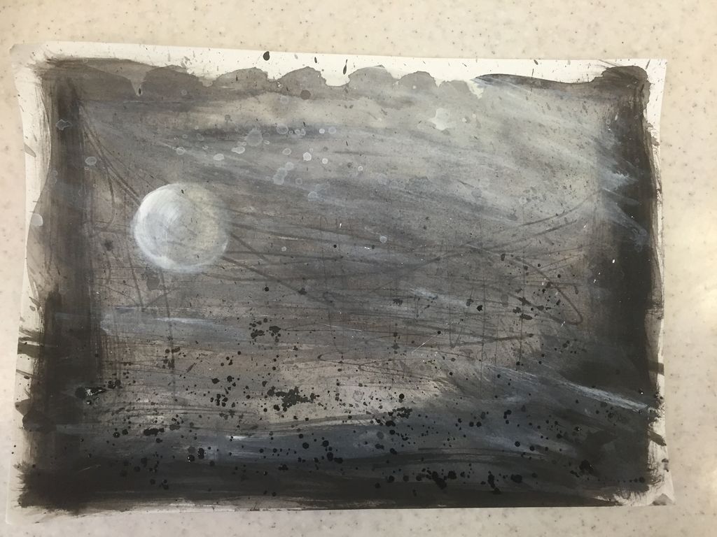
Likewise the banner behind the champion. My first idea was to use a crow illustration from the Fighting Fantasy books but it looked a bit lost on amongst so much else. The black lining could not really compete with the busy-ness of the model. So I painted over it with the most iconic Nurgle image possible, Les Edward's original illustration for the Lost and the Damned itself - just on a tiny scale!

It actually wasn't as hard to do as I though it might be. Once I had added some thin layers of background colour, I went about sketching the outline of the GUO onto the background with diluted black and then added the shadows with Rhinox brown, before building up successive highlights with a range of pale greens and yellows. I then re-emphasised the shadows and added some spots of pinky/red for the sores.


The champion himself needed to stand out amongst the colours I'd already used and I'd already decided that I wanted him to look quite pale. I ended up going a bit pinker than expected, only to make him pop from all the other colours. 

Writing this all out does always make me realise just how much internal thinking occurs when painting models, an ongoing internal monologue.

The final element to complete was the shield and again I wanted to create a nice contrast with the warmer colours of the champ, so I hit the demonic shield with the baby-blue treatment and a bit of subtle purple on the tongue and yellow on the horn to mimic the warmth of the flames higher up in the composition.


So has the painted version lived up to my expectations? Those expectations were pretty damn high after being so proud of the actual build of this model and I have to say that I think the paint job does the model justice. I'm certainly happy with all the decisions I made and the composition and balance of the whole piece holds up. I know I'll never be the best painter around, but this is up there with my very best.

Hope you enjoy it too. I'll post up some photos of the finished bitzbox warband later..

Friday, 6 May 2016

A new banner for my blog


I've decided to improve my little corner of the web here with some of my own art and a slight change in ambience, trying to make it easier on the eye and a little bit more damned looking. When I first starting blogging, I was entirely unprepared and unoriginal in choosing Les Edwards iconic illustration from the cover of the Lost and the Damned itself. It really is an image that stayed with me from a teenager to a middle aged geek and seemed appropriate for the introduction of this blog of mine.


However as the blog's developed and my influences increased, I started thinking about creating my own unique illustration, based on some of my favourite GW artwork from when I was a kid, particularly that of Adrian Smith and also some of the illustration from Fighting Fantasy which I have already used liberally in miniature projects.
For example the illustration of some Nurgle Warriors, below by Adrian Smith, has the characters facing us head on, in lovely contrasting black and whites, with a somewhat blighted background. But I have a personal dislike of compositions where the legs and feet are completely cut off, it prevents the figures from having the same grounding in their environment.


So I'd kind of decided upon the style (black and white, contrasting tones) with a Nurgle based subject matter - characters face on to the viewer with a dark ambience in the background and starting playing around with some black and white acrylics and inks:


I then decided that I did not want to lose all connections with the Lost and the Damned tome, so I thought about how I could incorporate some of the text from the book into my illustration. The art teacher in me thought instantly of good old Mod-Podge:


 and with a  mirrored photocopy of the opening page of Nurgle from the great book I was able to combine the text onto my background and re-work into it with some additional tones and drips etc.


So what for the illustration itself? I played around with the idea of creating my own Nurgle characters, but I wanted to link back to miniature painting exploits on this blog, perhaps drawing up one of my favourite models or greatest accomplishments. And then it hit me! Having recently completed the collecting and painting of all the original Nurgle Champions I considered working from one of my very own photographs of my very own models, this one in particular:


Below you can see the initial drawing outlined in black pen (and the title of the blog Mod-Podged on)


And then bringing in some further contrasting highlights with some white acrylic washes:


I think there's still room for improvement in the contrasting and definition of each drawn figure (although I wish I hadn't worked in A4 size - what a simple mistake - always work larger and scale down!), but I am interested in hearing your thoughts. Cheers in advance!


Ps. How do I resize the image at the top and why have I suddenly lost a load of my comments, I think all those from Google +? All help and comments appreciated (if they show!)