Showing posts with label tutorial. Show all posts

Thursday, 17 December 2020

My Magnetised Movement Trays/Display base (a tutorial)

 For some time now I've been making my own magnetised movement trays/display bases for my Lost and the Damned army, and as I was making one for my unit of 49 Diseased Flagellants I thought it would be a good opportunity to do a quick tutorial of what works for me. 


I magnetise both the top and bottom of my movement trays, the top obviously so that the models stay in place, the bottom so that all my movement trays can be safe in a large storage box and don't move about when in transit. Photos of that arrangement at the end. Now I realise that I could have saved a lot of time if I had made the tray out of steel and just applied magnets to the models and to the base of my storage box, but I went this way first and besides, steel is more difficult to work with.

Below you can see the tools and materials you will need for the basic construction of the movement tray:


From left to right: self-adhesive magnetic paper (thick), steel paper, balsa wood, 3mm plywood, thin polystyrene, pva glue, superglue, pencil, scalpel, metal ruler and scissors.


The first step is to cut the plywood to size. I used plywood as unlike card, it doesn't really warp and is easier to cut than steel. For this task, I knew that my unit was to be made up of 49 models (ranked 7x7), each on a 1 inch base, so the first dimensions drawn on were 7"x7". However you need to leave space for the movement tray edge, so here I added a 1/4" all around. So the overall size of the tray is 7 1/2" square.

Once the plywood was cut with a saw, I then measured (7.5" square) of the self-adhesive steel paper, sufficient to cover the bottom of the entire movement tray. This was drawn out and cut with scissors.


Back on top of the tray I then measured and cut a 7" square piece of the self-adhesive steel paper. This leaves a border for the balsa edges to be added. I find that balsa's ease of cutting is perfect for this. I use balsa that is slightly thicker than a warhammer base, which compensates for the raised height of the steel paper. Below you can see my measured and cut edges. 


These are simply glued in place with PVA and a stack of books added for weight to ensure a strong bond. Choose your books carefully and never use your best book at the bottom for fear of seeping pva! I used some of my wife's hardbacks at the bottom!


Here's the finished construction:


For the miniatures themselves, it is just a case of magnetising them. However the 25mm (1") bases are hollow, so they need filling. This is where the foam/polystyrene is great. I just superglue it in place:


And then cover it with an inch square of magnetic paper.


Here you can see the models on their movement tray and held at an angle. I could probably hold them upside down with the strength of the magnets:


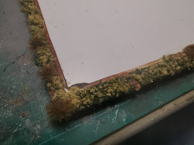
Finally the movement tray is based to match my Lost and the Damned army bases. 
1. Paint the base colour brown (earthy colours as sometimes you can see this through the yet to be added foliage)


2. Then a dark green Woodlands Scenics is pva glued into place:


3. For the two subsequent layers of lighter green foliage, the pva glue is diluted with warm water and a few drops of washing up liquid and applied using a dropper bottle so as to not disturb the layer that is already glued in place:


4. The two lighter shades of green are sprinkled on, avoiding any large clumping:


5. The final movement tray with scatter leaves and clump foliage:


And a close up shot:


Can’t wait to fill this with all the flagellants I’m currently kitbashing (I’ll share these in my next post).

Tuesday, 16 June 2020

The Great Lord of Decay

"What is the response of living men to the undeniable and inevitable futility of life? Is it to lie down and accept death and the coming to naught of their every endeavour? No it is not! Faced with the inevitably of death what answer can there be but to run through life at a great and unstoppable pace, cramming each day with hope, laughter, noise and bustle. Thus, happiness and human endeavour are sired by a coming to terms with decay and futility. This realisation is the key to understanding the Great Lord of Decay and his worshippers."

At the moment it feels like my hobby output is gathering pace, but it is, from past experience, very stoppable. However having this hobby does provide some relief from the futility of life, it gives me something relatively private to think about, to plan, to execute and the hope is always there that I can realise my intentions and make my hobby as good as it can be. So here is my latest endeavour, keeping the real decay and futility of life at bay, renewing an old miniature with inspiration from another old source and enjoying the process of making. Thus I am a worshipper of the Great Lord of Decay.

The quote above is from the same page of the Lost and the Damned as the Tony Hough illustration which my latest model is based upon, and reminds me of why I was drawn to Nurgle originally, many years ago. Not the contemporary bloated, pus filled, superficially plague ridden approach but the idea that in addition to this, in the face of death and decay there can be joviality; a carnival attitude, hustle and bustle. 

Here's my homage to that era of Games Workshop writing, illustration and model-making:


Here's a couple of edited images of the above photographs, which make it appear even more illustrative looking, with an exaggerated contrast and brightness. I couldn't quite get here with my painting and actually I'm not sure I wanted to.


And here is the model in front of Tony Hough's illustration. There is definitely some likeness and I hope I've caught the spirit of the art, but overall I'm well happy with how it turned out.


Here's some WIP photos and a breakdown of the painting process

1. Zenithal primed undercoat, grey followed by a white misting coat from diagonally above. This helped create an exaggeration of the shadows and highlights. (this photo is quite over-exposed so looks lighter than it actually was.)


2. A very dilute wash of a black Contrast paint (with a touch of washing up liquid) over the entire model. This unifies the undercoat, deepens the shadows and makes the detail so much clearer to paint.


3. A further, darker wash was applied just to the areas of shadow. The idea being to replicate the strong contrast of the original illustration.


4. Here you can see the steady build up of layered highlights, starting with a pale grey and adding subsequent quantities of white.


5. The final highlights were pure white, again to create that illustrative stark contrast. The plinth was painted last and deliberately left dark, highlighting up from black, to ensure attention wasn't drawn away from the model. It also meant that the black lip of the model's base blended in more with the outer plinth. Here I haven't started painting the elements on the plinth.


So that challenge, to recreate a Tony Hough illustration is done, I know there will be some amazing entries and I am very much looking forward to seeing what others do. For this blog, I'll be returning to the completion of my LostandtheDamned army; some colour and some warhounds next....


Monday, 20 January 2020

Thrud (and painting in verdaccio)

The iconic Citadel Thrud, long admired by me and one of those miniatures that I was always keen to get and paint, even though he was much more expensive than I would have liked. When I had the lump of lead in my hand, I contemplated my approach to painting him; I felt he deserved a slightly different approach to my usual style and process, partly because it is Thrud and also because there are such large areas of skin to paint. I searched for some other examples of painted Thruds and found some to be way too smooth, almost disguising and flattening the sculpt, or some that were too sinewy and textured, mkaing the anatomy look a little too awkward. So I aimed for something in between. 

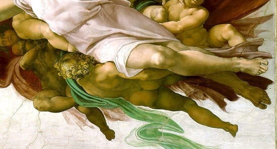
It also struck me as an opportunity to experiment; I remember from my Art History degree a technique used by Renaissance and pre-Raphaelite painters where they would under-paint the skin tones with a green hue, known as "verdaccio", which would help create the illusion of veins beneath the skin and to cool down some of the warmer skin tones.

Here's the finished model which I'm very happy with:


My image research led me to an example of verdaccio as seen on Michelangelo's Sistine Chapel ceiling painting:

Verdaccio underpainting

And here is the processes in getting there using this green under-painting:

Over a white primer I washed in a diluted Athonian Camoshade (a little washing up liquid added to help it flow). A second darker wash was added to the recesses/shadows.

Once dry a subsequent wash of Darkoath flesh was applied

I then started building up my layers of highlights using very dilute applications of Elf flesh with increasing amounts of white. This helped blend some of the warm reds into cold greens.

This creates quite a washed out effect (although the lighting here hasn't helped)

So I glazed with both warm flesh tones over the highlights and cold green for the shadows

Final highlights were then applied very sparingly.

I think the experiment was quite successful although I probably hid too much of the green under-painting with my layers. It's definitely a technique I would like to explore further and I have a Marauder Giant that has been primed years ago that may be the ideal candidate. For now I am currently painting a second Bob Naismith miniature as a companion for this Thrud and I've already made a little scenic base for them both. More on this next time. 

Friday, 18 October 2019

Painting Rugluds Armoured Orcs: 19 step tutorial

So last time I posted I shared with you my quick 2minute tutorial on how to make Orcy shields with some greenstuff and small beads. It follows that the painting stage comes next. Here's a completed threesome of Rugluds Armoured Orcs on a lovely old-school regimental base:


And here's how I got there.
1. The minis prepped and ready to go:


2. Primed. I always choose a priming colour that will help speed up or improve the process. White enhances the colours and allows for lots of washes, but creates problems when you have to add shadow and black is the opposite; the shadows are already in place but it is harder to get bright colours. With this in mind I went for grey, also because I realised that there was a lot of areas to be metallic on these minis and grey is good for that. I briefly consider going for zenithal priming but stopped as my aim for these is to go simple and quick and I don't feel I get much reward with that technique.


3. Skin basecoat. Slightly diluted Baneblade as per my orcy skin recipe.


4. I like to do the messy technique for the armour next, so any misplaced paint can be covered in the subsequent stages. A very rough undercoat of Leadbelcher for the metallic areas. I wasn't very precise or worried about coverage here, because the grey priming conceals and missed bits and because I will build up layers over the top.


5. The first of such layers is a very dilute covering of Mournfang Brown. This provides an easy wash to create a rusty appearance. Get your paint consistency correct and the leadbelcher will shine through on the more prominent/raised areas of metal and the rust colour will gather in the recesses.


6. Mix some Ryza Rust in with the Mournfang and apply a slightly less-dilute wash in some areas. With layers its always best to leave some of the first layer exposed, hence subsequent layers/washes are applied less liberally.


7. Dab on a few spots of pure Ryza Rust, especially around prominent/raised areas. Thats the ferrous metal areas done.


8. Now for the bronzes. Warplock Bronze base.


9. Hashut Copper highlight, leaving the Warplock in the recesses/shadows.


10. When dry apply a diluted wash of Oxide. Done.


11. Back to the skin. A wash of Earthshade with a tiny amount of washing up liquid added to break the surface tension of the paint and allow it to flow readily into the crevices of the skin.


12. When dry, highlight with Baneblade again (I'll probably skip this stage in the future - it made too insignificant a change in appearance for the time it took).


12A. A highlight with Baneblade and Ogryn Camo. The first time in the process that I used a decent brush!


13. Final highlight on the skin by adding some Bleached Bone to your previous colour mixture.


14. Some purple on the lips.


15. A touch of Chainmail to the belt buckles, spikes and some other raised areas of metal.


16. The wooden areas were highlighted with a pale grey in vertical, wavy lines to represent grain. This was on the spear shafts, crossbows and on the back of the flat shields.


17. A quick wash of Seraphim Sepia and Camoshade helps make the wood look weathered with some greeny/browny colours working well alongside the grey. At this stage I drybrushed the shield design white for the bext stage.


18. And back to the shields. These add a bit of variety to the unit so deserve a bit of attention. Over the white drybrush strong, yet dilute, Citadel Inks were applied.


19. Then they were highlighted with a touch of the same ink mixed with white. Two such lighter highlights were applied. I like my shields, can you tell? And finally based:


And here's where I'm up to with the unit thus far: